Skip to content

Cura. Magazine
Making an Exhibition

The multifarious relations of graphic design with exhibition making seem to be at the centre of attention of all who are interested in the exhibition context or operate within it.
Cura.” magazine – a quarterly that is part of a wider curatorial project – has launched, with its Spring/Summer 2012 issue, a new feature, Making an Exhibition, that ‘investigates different aspects of curating and exhibition making,’ and it does so by focusing on the practical issues rather than on theoretical ones. The feature aims at looking behind the scenes, at all the figures who are usually involved in the collective process of making exhibitions.

The first survey is dedicated to graphic design, with four interviews made by Adam Carr with APFEL, Jurgius Griskevicius, Jon Sueda and Alpha 60.

For all these designers the involvement with art and cultural institutions has started quite early, right after school years, or is rooted in relations and interests born in those years. Beside the story of early projects, the questions of Carr invite the interviewees to discuss the role of graphic design in the making of exhibitions and the line between support and excess. ‘There is a thin line,’ Griskevicius points out, ‘between graphic design as an assistant to an object and as being an object itself,’ and Sueda believes that ‘if the graphic design is not in support of the exhibition narrative, then it can only get in the way or misrepresent the story,’ while Apfel say that ‘the extent to which we allow our exhibition graphics to come forward and draw attention to themselves always depends upon the context and content of the show.’ The variety of actors, factors and constraints involved in the process of making an exhibition – from budget to personal relationships – also come up in the answers, that emphasise the specificity and the collaborative nature of all projects. Among the materials and solutions designed for exhibitions, such as identity, signage, and printed documentation and presentation, the latter seems to get the preference of designers, apparently because printed matter allows a more personal contact with the public. Griskevicius likes doing print based work because catalogues and leaflets, for example, are ‘something a viewer can take away and in that way they can have a piece of the exhibition’; similarly, Joe Miceli tells that Alfa 60 tend to design catalogues or even posters that can also work as a guide to the show. Finally, the designers interviewed by Carr seem to feel that in their practice there is a continuity of approach between graphic design for printed matter and for the exhibition space, as well as between exhibition design and editorial design.

It is noteworthy that this issue of “Cura.” also features – in the pages right before Making an Exhibition – an interesting interview with Emily Pethick, concerning her experience as director of The Showroom in London.

Wide White Space
The Book

Wide White Space (The Way Beyond Art) was an exhibition held in 2011 at the CCA Wattis Institute in San Francisco – aimed at investigating ‘graphic design’s evolving relationship with the practice of exhibition making as it intersects with the visual arts and the work of both artists and curators’ –, a series of lectures, and a series of small exhibitions curated by students, each devoted to the work of a graphic design team. Wide White Space (The Way Beyond Art) is now a book that documents and illustrates all these activities. The book will be launched on August 1 (and available soon to order from the website http://widewhitespace.net).

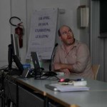
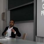
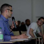
As the curator of the project, Jon Sueda, explained in the talk he gave at the conference we organised in Bolzano last month, the Wide White Space exhibition emerged from a personal motivation, being himself a graphic designer who is engaged in the exhibition context, in issues of exhibition design and making, collaborating with curators, artists and art institutions. Also, being a designer who, since he left school, has organised a number of exhibitions as a means to gather people together, as well as to produce and discuss works. (Sueda also confessed he feels uncomfortable to be called ‘curator’, feeling rather an amateur.)

Beside the personal motivation of Sueda, the idea of organising the exhibition was actually born within the CCA Wattis Institute of Contemporary Art in San Francisco, of which Sueda is art director since 2007. The Wattis is an institution that not only presents international contemporary art but is also a special forum of reflection and discussion on curatorial practice. The Institute is directed by Jens Hoffman, a curator who also teaches at CCA and who is co-editor of “The Exhibitionist”, a journal ‘made by curators for curators’, entirely focused on exhibition making and curatorial studies. (The design of the journal, which references the “Cahiers du Cinéma”, is by Sueda.)

It is in the framework of its ongoing investigation of exhibition making that, in 2010, the Wattis decided to launch a series of exhibitions entitled The Way Beyond Art that aim at approaching ‘the subject of curation and exhibition making through non-fine art subjects,’ thus opening to disciplines such as industrial design, architecture, film, literature and graphic design: all disciplines that ‘have their natural places outside the gallery but are increasingly finding their way into the exhibition space,’ in the words of Claire Fitzimmons, deputy director of the Wattis Institute (see her introductory essay to the publication Wide White Space).

As concerns graphic design, the exhibition held in 2011 was curated by Sueda in collaboration with the CCA’s Undergraduate Program in Graphic Design and the Graduate Program in Design. The exhibition’s scope included the diverse relationships that link graphic design and designers with exhibition making. A number of international works, institutions and designers – mainly, although not exclusively, from Europe – were selected to exemplify three themes: 1. innovative graphic design identities created for [art] exhibitions and institutions; 2. works resulting from the unique collaboration of graphic designers with artists and curators; 3. exhibitions and time-based projects initiated by graphic designers. A criterion for selecting the designers, according to the curator, was that they ‘consciously construct a narrative around their work, position themselves as authors of autonomous creative projects, and maintain a conceptually rigorous, research-based, historically fortified approach.’
The exhibition was organised using different display approaches. Two rooms presented graphic design artefacts and ephemera in a traditional way, on walls and in vitrines – including, among many other projects, the identities of Casco (Utrecht) by Julia Born and Laurenz Brunner, of the Boijmans van Beuningen Museum by Mevis and Van Deursen, of the Walker Art Center (Minneapolis), and of the Stedelijk Museum (Amsterdam). The other three galleries, instead, were devoted to display works of designers acting as curators of projects, be they in the gallery space, in their home, or via the Web. In this second part of the exhibition, the curator decided to re-stage time-based projects as well as exhibitions previously held elsewhere, actually creating an exhibition of exhibitions – including Julia Born’s Title of the Show and Experimental Jetset’s Kelly 1:1.

The presentation of the exhibition, the list of graphic designers and institutions whose work was on display, and images from the show are all available online.
The book Wide White Space offers now a more extensive documentation of the entire project, including interesting essays.
The first 64 pages feature the Foreword by Fitzsimmons, a collage of short interviews with Jon Sueda, the catalogue of designs and designers on display – each introduced by a text and illustrated by an image –, and a text by Project Projects about exhibition design and graphic design exhibitions (Project Projects are among the designers featured in the show.)
The second part of the publication, Wider White Space (marked by a different paper and printed in two colours), documents how the Wide White Space exhibition was developed into a wider program of activities focused on exhibition making and graphic design. This program included a series of talks given by faculty from the undergraduate and graduate programs of the CCA, a special course lead by Sueda and the series of small exhibitions that resulted from the course, curated by the students and each devoted to the work of a graphic designer or team (APFEL, Experimental Jetset, Walker Art Center, Project Projects).

Overall the texts included in the book provide a varied collection of perspectives on graphic design, the exhibition context and the curatorial, and on their intersections.

Close Encounters, by Project Projects, is structured in five paragraphs: Presentation, Action, Confusion, Distribution, Contextualization. The first paragraph deals specifically with the exhibition of graphic design: Why exhibit graphic design and graphic artefacts in a physical context? Why do so at a time when museums and institutions show an increasing interest in virtual mediation of contents and of the visitor’s experience? By briefly reviewing the aims and approaches of graphic design exhibitions held in the recent years – from site-specific installations by designers to the exhibition of existing designs and artefacts – the authors conclude that ‘[i]t’s almost as if, in the decades of desktop publishing and cloud computing […] the field has become so virtual that now the job of graphic design exhibitions is to bring the work itself back down to Earth.’ The following three paragraphs of the essay discuss the social quality of exhibitions and how exhibition design can contribute to engage the public; the confusion of roles and functions that occur between artistic practice and exhibition design, between what is on display and the display structures, and between the exhibition itself and its documentation; the (limits and richness of the) distribution, representation and mediation of exhibitions over space and time. Finally, the Authors consider one of the most critical issues regarding graphic design in the gallery: the contextualisation of something, design, that is ‘meant to be viewed in some “real world” context’ and not in the white cube. Project Projects illustrate some alternative strategies to deal with this issue.

In her essay, ‘With Every Movement… The Impression Changes’, Emily McVarish carefully reconsiders the work of El Lissitzky as a figure that is particularly worthy of consideration in the light of contemporary graphic design and, she argues, specifically of the kind of works selected for the Wide White Space exhibition. The creation of exhibitions was central to Lissitzky’s practice, as was his interest in creating dynamic situations. McVarish focuses on some works from the 1920s that exemplify the evolving graphic approach to the exhibition space: the Proun, the Proun Room, The Room for Constructivist Art, the Abstract Cabinet and the Soviet Pavilion at the Press fair. These works show how Lissitzky used the design of the exhibition dimensions (surface, space and time) to empower the viewers’ movement, to make them active and engaged, thus anticipating participatory forms of art and of interactive design.

Rachel Berger, a graduate from Yale, illustrates the problems of exhibiting graphic design through the case of the Yale MFA Graphic Design Show: Twenty years of shows since the 1980s, when Sheila Levrant de Bretteville took on the organisation of the department of Graphic Design, housed in the Art and Architecture Building designed by Paul Rudolph, up to the shows held in the new venue Green Hall, where the Yale School of Art moved in 2000. In particular Berger points out how, in the new millennium, the focus of attention of students has shifted from making their works look good to address conceptual issues, adopting a more curatorial approach to the organisation of the shows: ‘From “Does my book look good?” to “Does it make sense to include my book?”’. The Author illustrates three attitudes which have characterised the recent years of the shows at Yale: to question all assumptions, to focus on a main, single, concept, and to impose restrictions. Finally, Berger tells the story of the graduation show that she and her colleagues set up in 2009 – Lux et Veritas. Not concealing the difficulties the group of students faced in the process of curating and making the exhibition, Berger explains how they finally opted for a video presentation of their works in the gallery setting.

MacFadden & Thorpe similarly offer a personal look into the meaning that exhibitions have for designers, and especially on the relevance that the exhibition context may have for designers who, like them, are used to make also work for their own expression and are interested in producing site-specific works. Seeing graphic design in the context of galleries, they write, ‘makes you feel that as a practitioner, what you do has some cultural relevance,’ that it gains some aura, and it can get more focused critical attention. Through examples drawn from their experience as well as from other designers’ works – such as projects by Stefan Sagmeister and Geoff McFetridge, specifically designed for the gallery display –, as well as from the Wide White Space exhibition, MacFadden & Thorpe support the gallery as a place that can offer both historical design and contemporary design a context for study and appreciation.

The last essay in the book, is by Eric Heiman (founding partner of Volume Inc.), A Meditation on Space (In Four Parts). The topic he deals with is one that comes up, here and there, in the other essays too: The physical and social nature of exhibitions and of the exhibition space and experience. First Part illustrates the importance of activating the space and underlines the role that design can have in building experience within it. Second Part focuses on art spaces and galleries, just to shift the attention to art projects that have rather taken place outside white cubes, right in the streets, struggling to engage the public and to foster people’s active participation. Part Three turns to graphic design, with some examples of works by Heiman and Volume Inc. that have sought to include ‘participation, tactility and the experiential.’ Part Four considers how in the recent years communication and experience ‘have totally converged’ and raises some doubts on the benefits of having technology all around us, mediating our experience of the world, of objects, space, and relations: ‘Sometimes, silence … is the best design solution of all.’ (The text of Eric Heiman is also available online at http://blog.sfmoma.org.)

Shots and Quotes from the Conference
Graphic Design, Exhibiting, Curating

Some shots and quotes from the conference Graphic Design, Exhibiting, Curating that we organized on June 26. A publication including the talks and extracts from the discussion will follow in Autumn-Winter 2012.

«People who disagree with the exhibition of graphic design give the argument, among others, that graphic design is about context, and the exhibition of graphic design – the creation of an artificial setting – goes against its function. In my case, I interpret the context of a graphic design exhibition as a way to reactivate the objects through a critical or artistic prism, as an exercise of formatting a new space of existence for the designed objects.
The format of the exhibition can thus provide books, posters, or other artifacts an extended life that allows to approach them by posing new issues that cross and engage different disciplines and actors – artists, theorists, designers, etc.»
Charlotte Cheetham (Manystuff.org)

«We founded Lungomare, first, because we felt it a necessity to open up a space for discussion and interaction, where dialogue can take place. The aim was, and still is, to open up the meaning of design, and not to practice it as a discipline that stands alone. … In the projects that we organize we want to figure out how design scope can extend. … Instead of fulfilling expectations, we are much more interested in creating expectations, and in inviting the spectators to discuss them within a larger frame. … The projects of Lungomare aim at creating a more immediate relation with the public, and at sharing moments of reflection and negotiation. …
The nature of graphic design is a process of dialogue, analysis, research, editing, curating and organizing.
We always work with a large network of people. We do curate projects and invite other people to curate projects. We do a lot of discussions, and conferences. Lots of projects also leave the city context behind and try to engage the wider geographical context.»
Lungomare / Lupo&Burtscher

«When given the possibility to exhibit our work, we more and more tend to bend, in the sense of mooding, adapting or appropriating the spaces and the other resources that are at hand. And this sort of occasions becomes moments of collective learning and production. …
We think that in a moment in which more and more attention is being given to the exhibition of design works, there is a real chance for re-thinking how the moment of the exhibition can support projects that are built on the assumptions that as designers we need and we can imagine other ways of relating to each other, other value practices, and other ways of working and interacting with the world. Therefore we would like to pose the question of how the various possible exhibition contexts and the collaboration with institutions and curators can enable as well as push such critically engaged practices.»
Brave New Alps

«I am interested in questions of agency, between curators, exhibition designers and artists, and how some of these roles overlap. Who takes the authority for the exhibition, and how does an exhibition arrives at a kind of confluence of interests? Obviously there are many historical precedents we could talk about. We can talk about El Lissitzky’s Abstract Cabinet, in Hanover [Landesmuseum], 1926-27, that is a very interesting moment when somebody functions not only as the person who creates the display system in order to activate the viewer, but also chooses the works within it, in this social circle of the people that he is working with… for better or worse it is really embeddedness that happens here. What is interesting to me is this focus on activating the viewer, creating a kind of rupture, a way of looking at works that do not claim to be neutral or unmediated.»
Prem Krishnamurthy (Project Projects)

«When I started the gallery, The Narrows, there was not clear objective of what I would show. It was an evolving project. … A lot of projects were driven by the idea that as a child I never thought I actually would travel to Europe; so I was always really excited when I would see a record cover or a magazine with a work from a Swiss designer, or a Josef Müller-Brockmann book, for example. So the gallery itself was a sort of crusade to bring European artwork to Melbourne.»
Warren Taylor (The Narrows)

«Over the past ten years I have been organizing nine exhibitions, as I said earlier. Just gone out of schools, I did not have much work… I did not take it very seriously, in fact it was rather the social aspect I was interested in: I liked the idea of bringing people together to discuss design and different kind of works. This was the motivation, rather than wanting to be a curator – and in fact I feel rather uncomfortable calling myself ‘a curator’ sometimes, since I feel I am like an amateur. Anyway, I am going to introduce this exhibition called Wide White Space, which I curated about a year and a half ago at the Wattis Institute. The show is an exhibition about exhibitions, designers working on exhibitions. My early motivation for doing this exhibition was really selfish in a way, because it is about what I do, and I saw it as an opportunity to really conducting research and look into this interesting area which I think is a fruitful area for graphic designers to practice. This exhibition particularly focused on graphic designers who create work in the following three areas: identity for exhibiting institutions, designers who forge collaborations with curators and artists, and designers who launch their own-based exhibition initiatives.»
Jon Sueda (CCA)

«Now we are here: a new generation of professionals, artists and designers are coming of age. They grew up with mobile phones, Internet, and virtual worlds. Technology is a fundamental part of their culture and identity. This new generation is actually not so busy in creating its own visual language, they work with templates and software that determine what they create. I think this is rather the future of graphic design. This is also the reason that I am changing the museum a little bit. Graphic design is disappearing because the diverse disciplines are merging. And so I changed the name of the museum from Graphic Design Museum to MOTI, Museum of the Image. And of course MOTI has a strong connection with the world of information and media, which comes from graphic design but goes towards what I call the ‘future of graphic design’, that is visual culture or image culture. … Graphic design has transformed into a varied contemporary media world. What was supposed to be a small and craft-based profession called ‘graphic design’, has become in the twenty-first century a very popular and democratised discipline at the center of art and media. And technology develops further. We have no rules any more. We are departing from the graphic profession as it developed in the 1970-80s. We are now part of the explosion of image culture, a bombardment of visuals all around us. Technology creates a culture for the mass.»
Mieke Gerritzen (MOTI Breda)

Most Beautiful Swiss Books 2011

Most Beautiful Swiss Books 2011 (awarded in January 2012)
first held at Helmhaus Zürich, Zurich, July 5-8, 2012
and later traveling to other venues (see schedule)

Statement: «The competition ‘The Most Beautiful Swiss Books’ on an annual basis. It thereby recognizes excellence in the field of book design and production, as well drawing attention to remarkable and contemporary books by Swiss designers, printers and publishers. The independent, five-member jury presided by Manuel Krebs, awarded a total of 27 books from a total of 392 submissions as the most beautiful Swiss books of 2011. The Jan Tschichold Award, which honours excellence in the field of book design, this year goes to printer Erich Keiser of the Druckerei Odermatt in Dallenwil (canton of Nidwalden), Switzerland.
For the first time in nine years, two children’s books have been awarded: ‘Oskar Tiger’ by Dieter Meier and Franziska Burkhardt (Kein & Aber) as well as ‘Ghost Knigi’ by Benjamin Sommerhalder (Nieves).
The jury takes into account each book’s overall concept, graphic design and typography, and pays particular attention to innovation and originality. Further criteria include the quality of the printing and the cover, the binding and the materials used.
From 6. to 11. July 2012, the The Most Beautiful Swiss Books will be exhibited at the Helmhaus Zürich, alongside the simultaneous publication of the catalogue showcasing the competition (design: Aude Lehmann). On the occasion of the exhibition opening, the Jan Tschichold Award winner will receive his award.
In the autumn of this year, the books will be presented, for the first time, at ECAL/University of Art & Design Lausanne. As in the previous year, all the submitted books entered into the competition will be displayed alongside the award-winning titles.»

Below, the installation of the same show in Treviso, Italy, curated by polakopolako.it.

Two or Three Things
I Know About Provo

provo-brno_05

Two or Three Things I Know About Provo
first held at w139, Amsterdam
later on show at the 25th International Biennial of Graphic Design in Brno, June 22 – October 28, 2012

Statement: «Invited by the organizers of the 25th International Biennial of Graphic Design in Brno to guest-curate one of the exhibitions, Experimental Jetset decided to present a reworked version of Two or Three Things I Know About Provo, the exhibition that originally took place in the beginning of 2011, at Amsterdam art space W139.
For the Brno Bienniale, Experimental Jetset have reworked and reinterpreted their original exhibition, adding new material and updated texts, as well as video- and audio-material. Also included in the show is a brief research project by Femke Dekker (of My Little Underground), who will look at some early encounters between Provo and like-minded Czechoslovakian groups.
On the occasion of the exhibition, the Moravian Gallery will publish a small catalogue, designed by Experimental Jetset and featuring contributions by Auke Boersma, Johannes Schwartz and Marek Pokorny.
[…]
(Continued)

Reading Forms
Exhibiting Graphic Design Exhibitions


Reading Forms
http://readingforms.com – is a valuable reference to explore for everybody interested in graphic design, exhibiting and curating. Launched in January 2012, almost in the same period when we started our research project, this website is curated by Yotam Hadar, a young Israeli graphic designer and is meant as a «depository of hyperlinks and images of graphic design exhibitions, and of other situations that are visually, thematically or conceptually related. It tries to examine modes and forms of presentation, observation, curation and interaction in the recontextualized display of graphic design».

We have asked Yotam some questions about this website and project, and his opinion about the involvement of graphic designers in exhibiting and curating.

What is the motivation behind Reading Forms and the reason of your personal interest in graphic design exhibitions? What connections are you trying to draw from this depository?
YH: I think the main reason for starting Reading Forms is the same catalyst behind many websites: I was looking for a resource dealing with the subject of graphic design exhibitions, but I couldn’t find any. So I started one myself.
I was fortunate enough to attend some really great graphic design exhibitions in recent years (Forms of Inquiry at the Architectural Association, London, in 2007, Yale’s amazing GDMFA 2009 show and the 2010 Graphic Design Biennial in Brno). The feeling of being physically surrounded by such great design, thoughtfully curated, is something I thought is worth trying to relive. 
I feel Reading Forms has quite a superficial standpoint. As it is presented, it is simply a «depository of hyperlinks and images of graphic design exhibitions». It is more akin to the Tumblr attitude of decontextualizing images around a specific subject then to a critical or investigative platform. I think that part is left to the viewer. 

Graphic designers seem to show growing interest in participating in exhibitions, or in initiating them. What aims do you read behind these forms, this phenomenon?
YH: I think that the first and most obvious personal motives to initiate or participate in design exhibitions are distribution and exposure. Every designer which is proud of his or her work is always happy for new viewers/readers/users to appreciate it. It is the physical equivalent of being published in a popular design blog. 
Another reason for this need to share one’s work is the rise of what is usually referred to as the “Designer as Author” issue – i.e. designers being responsible for the content of their work, not just the shape of it – and which, for instance, can clearly be seen in the latest major graphic design exhibition held in the USA, Graphic Design: Now In Production.
Beyond these motivations, there can sometimes be a case of cult of personality – the superstar designer, who uses exhibitions as another device for self promotion. 
Lastly, there is the eternal debate of “Design as Art, Design vs. Art”. Is graphic design art? are graphic designers artists? Design exhibitions are fertile grounds for continuing this debate. 

As you say, being on show can be seen as the physical equivalent of being published. Do you see any difference from the designer’s point of view?
YH: A design exhibition is a decontextualized display, where artifacts usually lose their original function. In the design process, the designer usually has a typical viewing/usage scenario for their work, which tend to shift in an exhibition. 

In your answer to the first question you mention the «feeling of being physically surrounded by great design». In fact it seems that phisicality and direct relations with objects and people are one of the main motivation for designers to exhibit. Do you agree?
YH: I agree. Today we mostly experience and interact with design through screens, and that medium-shift into the tactile and physical is exciting. And in addition, as you mention, in an exhibition setting our “social networks” come to life.
 
Do you have personal experience with exhibiting and curating?
YH: My work has been exhibited several times, usually in exhibitions following design awards or competitions. I don’t see these contexts as a classical art-like exhibition moment, though, because curation is almost non-existant – participation in determined by a jury who judges the work not for the narrative of a future exhibition. In those cases, an exhibition is an inventory of winners, not a body of work that is curated to communicate anything but tracing the current trends in the field of design. 
The key difference may lie in the exhibition trigger – if it is a call for entries with open submission, or it is curated participation. 
Regarding curation, unfortunately, I haven’t had the chance to curate, yet, but I’m eagerly looking forward to it.

Zak Kyes Working With…
Chicago

Zak Kyes Working With… from Graham Foundation on Vimeo.

Zak Kyes Working With…
Graham Foundation for Advanced Studies in the Fine Arts, Chicago, June 14 – September 23, 2012

See the older post about Zak Kyes Working With… in Leipzig and in London.

Graphic Modern, USA, Italy and Switzerland 1934–66

Fordham University at Lincoln Center
Center Gallery 113 West 60th Street
June 4 – July 26, 2012

Curators: Patricia Belen and Greg D’Onofrio (Kind Company)
Statement: «Modernism, an ideology that covers a range of styles, is rooted in the Russian and European avant-garde including Constructivism, Dada, De Stijl, Futurism, and the New Typography – movements which signaled a modernization of culture and society beginning in the early 20th century. Artists and designers made a conscious effort to reject ornamentation and historical styles, and instead chose to embrace abstract principles, clear communication, geometric forms and visual experimentation. graphic Modern presents Graphic Design as a fundamental component of the dissemination of early to late Modernism throughout the United States, Italy and Switzerland from the late 1930s to the middle of the 1960s. During these years, Modernism’s distinctive graphic languages moved away from its political beginnings and emerged as an integral part of mass culture, extending from advertising and printed ephemera to corporate identity.
Bringing together over 75 works from Display, Graphic Design Collection, Graphic Modern serves as an overview of this important period of design and features advertisements, periodical covers, posters and ephemera examples from design pioneers including: Herbert Bayer, Lester Beall, Robert Büchler, Confalonieri e Negri, Alan Fletcher, Karl Gerstner (Gerstner + Kutter), William Golden, Carl Graf, Franco Grignani, Max Huber, Lora Lamm, Matthew Leibowitz, Alvin Lustig, Herbert Matter, Fridolin Müller, Remo Muratore, Hans Neuburg, Erik Nitsche, Bob Noorda, Sigfried Odermatt, Giovanni Pintori, Paul Rand, Emil Ruder, Studio Boggeri, Albe Steiner, Ladislav Sutnar, Fred Troller, Massimo Vignelli, Carlo Vivarelli and Yves Zimmermann among others. The varied and unique styles and sensibilities of these designers are the foundation for the visual language of today and presumably, tomorrow. From the experimental to the playful to the rational, Modernism’s strong idealism is a testament to its vitality and long standing. graphic Modern is a unique opportunity to view such a varied collection of items, many rarely exhibited in the United States.»

Graphic Design, Exhibiting, Curating
Conference, June 26, 2012

Graphic Design, Exhibiting, Curating
International conference
Faculty of Design and Art
Free University of Bozen-Bolzano
June 26 / 10:00-18:00

On June 26, 2012, the international conference Graphic Design, Exhibiting, Curating will take place at the Faculty of Design and Art of the Free University of Bozen-Bolzano. The conference aims at addressing the multifarious relationships that exist between graphic design, the exhibition context and curatorial practice.

The speakers include: Brave New Alps (Bianca Elzenbaumer, Fabio Franz), Charlotte Cheetham (Manystuff.org), Mieke Gerritzen (Museum of the Image, Breda), Lungomare / Lupo&Burtscher, Prem Krishnamurthy (Project Projects), Jon Sueda (California College of the Arts), and Warren Taylor (The Narrows).
Invited discussants who will contribute to broadening the scope of the conference are: Jonathan Pierini (Free University of Bozen-Bolzano), Silvia Sfligiotti (Progetto grafico), Francesco Valtolina (Mousse), Carlo Vinti (University of Camerino).

Further info about the conference program is available here.

Solution Greece? Zak Group

Solution Greece? Zak Group
OMMU, Athens, Greece
May 25 – June 16, 2012

Statement: «OMMU presents the first exhibition in Greece by the London-based design office Zak Group. For the exhibition, Zak Group presents the Sternberg Press Solution series, edited by Ingo Niermann and designed by Zak Group beginning in 2008.
The Solution series invites authors to develop an abundance of compact and original ideas for countries and regions, contradicting the widely held assumption that after the end of socialism, human advancement is only possible technologically or requires a yet-to-be-established world order. In Solution 9: The Great Pyramid, Niermann writes: “When I told Rem Koolhaas about my title idea for the book series, he seemed earnestly alarmed. ‘Solution’ is a word he never uses. He demonstrated how his hand automatically begins to shake as soon as he even wants to write it.”
Zak Group is a London-based design office founded in 2005 by Zak Kyes; in 2012 Grégory Ambos joined as partner. The studio’s work has been included in the 22nd International Biennale of Graphic Design (Brno, 2009), “Graphic Design for and Against Cities” (Corner College, Zurich, 2009), “The Malady of Writing” (MACBA, Barcelona, 2009), “Wide White Space” (CCA Wattis, San Francisco, 2011), and “Graphic Design Worlds” (Triennale Design Museum, Milan, 2011).
For the exhibition OMMU has produced 25 + 10 A.P. limited edition two-color screen prints for sale through the bookshop titled “Solution Greece?” by Zak Group with Ingo Niermann.»