Metahaven: Islands in the Cloud
MoMA PS1, New York
January 20 – April 1, 2013
Statement: «Founded by Vinca Kruk and Daniel van der Velden in 2007 as a design and research studio, Metahaven has come to define a new methodology in graphic design. The studio’s speculative practice privileges the vocabulary of graphic design as a means of knowledge production, using it as a tool to analyze organizational models and power structures. Investigating political and economic design—including nation branding and logo production—in relation to statehood, currency and information networks, Metahaven places particular emphasis on transparency and visibility.
The Amsterdam-based studio produces a continuous stream of research that rarely results in finite, codified work. They publish books and essays, organize conferences and collaborate with policy makers, concurrently working on new commissions while maintaining a variety of self-initiated projects. Recent activities have included a range of research, identity and product design for WikiLeaks, as well as proposals for the identity of Sealand, a self-proclaimed sovereign nation-state located on a platform built by the British seven miles off the English coast as part of a naval defense strategy during World War II.
Materials from both projects are included in this xhibition, alongside elements relating to a new cloud hosting enterprise based in Iceland. Islands in the Cloud is the first museum show to focus on Metahaven’s unique practice.»
Curators: Peter Eleey, Curator, MoMA PS1, with Alhena Katsof, Volkswagen Fellow.
Support/Funding: The exhibition is made possible by the MoMA PS1 Annual Exhibition Fund.
Tuesday, January 15, 2013

Graphic Advocacy: International Posters for the Digital Age 2001–2012
first held on January 15 – March 2, 2013
Stephen D. Paine Gallery, Massachusetts College of Art & Design, Boston, Massachusetts
(now traveling: see the schedule)
Statement: «As a medium for social change, posters record our struggles for peace, social justice, environmental defense, and liberation from oppression. From the confrontational and political, to the promotional, persuasive and educational, the poster in all its forms has persisted as a vehicle for the public dissemination of ideas, information and opinion. Posters are dissent made visible—they communicate, advocate, instruct, celebrate, and warn, while jarring us to action with their bold messages and striking iconography. Posters also serve as a telling indication of a graphic designer’s commitment to society when non-commissioned posters are created as vehicles to raise money to support political and humanitarian causes. Without a doubt, the poster remains the most resonant, intrinsic and enduring item in the arsenal of a contemporary graphic designer.
Ready access to broadband and mobile communications and to digital production technologies has expanded the poster’s role well beyond the limitations of the printed surface, and in its wake has created a modern tool for support and protest. These new technologies promote truly global conversations coupled with unprecedented opportunities for changing attitudes or showing defiance or solidarity. The poster, with its mix of both low-tech and high-tech, of old and new, has become a cornerstone of 21st century advocacy.
Graphic Advocacy: International Posters for the Digital Age 2001–2012 showcases a selection of 122 posters to offer the public a chance to experience this magnificent body of empathetic and visually compelling messages for our time.»
Curator: Elizabeth Resnick
Also available online:
– photo galleries of the different installations.
– an essay by Kenneth FitzGerald, “12 Views of 120 Posters”
– Interview with Elizabeth Resnick, by Steven Heller
Filed in Collective exhibitions, Contemporary, Critical Design, Curating, Exhibition, Galleries, Posters, Protest, Schools, Travelling exhibitions, USA
|
|
Wednesday, December 26, 2012
MVP – MOST VALUABLE PUBLISHERS
December 6-8, 2012 / Rookie Festival, Municipal Gallery Arsenal, Poznań PL
December 29, 2012 – January 13, 2013 / Arsenał City Gallery, Poznań PL
Curator: Honza Zamojski
Artists: «The sports analogy of the ROOKIE FESTIVAL is extended through to the MVP exhibition, applying the title to the Most Valuable Publishers on the market. The assessment isn’t an exaggeration as this the first Polish survey of dozens of publications from leading artists as one collective exhibition. For these artists, the book is an essential element, for many even a key focus, of their artistic practice. Featured works include the para-architectural objects of Tauba Auerbach and Josh Smith’s experimental forms through the conceptual activities of David Horvitz and Rick Myers. At the event, each of the artists will share their own characteristic approach to publishing. For some it provides a space for conceptual speculation and formal play, for others it is an archive for earlier works. Some pursue the nobility of the printed page, others stretch the notion of the “book” and its audience, composing dialogues or acting as performers in the urban space, such as Aleš Čermák. At the same time, the publications brought together by curator Honza Zamojski at the show compose a unique collection of his own publishing projects, while giving an insight into his artistic fascinations. The show also demonstrates how books are an irrevocable part of the artist’s presence, not only in the contemporary art world, but also within the consciousness of the public at large.»
Artists: Tauba Auerbach, Cezary Bodzianowski, Christophe Boutin, Maurizio Cattelan, Aleš Čermák, David Horvitz, Brian Kennon, Rick Myers, Paulina Ołowska, Slavs and Tatars, Josh Smith, Tadej Pogačar, TTC (Emil Alsbo, Magnus F. Clausen and Simon H. Hansen)
[Works in the show have been provided courtesy of the artists and Foksal Gallery Foundation, Printed Matter Inc., Three Star Books]
Saturday, November 17, 2012

(via manystuff)
Project Projects: Test Fit
November 17, 2012 – April 28, 2013
Art Institute, Chicago (Gallery 286)
Statement: «Project Projects, a New York–based graphic design firm led by Prem Krishnamurthy, Adam Michaels, and Rob Giampietro, has become known for developing publications, exhibitions, and identities for a range of cultural institutions and educational organizations, as well as for creating self-initiated curatorial and research projects. Project Projects has won numerous awards for how it addresses intellectual, cultural, and social questions related to daily life, and how it probes the discourse of graphic design. Commissioned as part of a series in which architects and designers are invited to explore their own interests as a way to instigate new thinking and practices within and beyond their professional disciplines, this exhibition provided Project Projects the opportunity to use the permanent collection of the Art Institute as a means of investigating the curatorial process and issues related to exhibition design.
The studio was initially inspired by the mock-ups that curators often produce when preparing the layout of an exhibition. Driven also by the unusual characteristics of the Kurokawa Gallery, which is a well-trafficked, transitional space between the Modern Wing and other parts of the museum, Project Projects decided to develop a model of an exhibition that could serve as a framework for addressing issues of representation and reproductions in a playful, yet critical way.
The studio’s selection of works is based on the personal concerns of its partners, as expressed in the accompanying texts they have written. Although they began with an interest in European modernism, as imported to Chicago in the mid-twentieth century by such practitioners as László Moholy-Nagy and Ludwig Mies van der Rohe, the present collection of works speaks more broadly to Project Projects’ own interest in the history of design practice. Using a consistent format of printed facsimiles at a one-to-one scale, the studio encourages viewers to consider this exhibition as a mode of creative and cultural expression in and of itself.»
Sponsorship: Exhibition made possible by the generous support of the Architecture & Design Society
Filed in Art and Design, Collection, Context, Curating, Exhibit design, Exhibition, Exhibition Making, History, Installation, Modern Design, Museums, Photography, USA
|
|
Wednesday, October 17, 2012

Eric Wrenn OFFICE at OMMU
Postcards and Rare Multiples
OMMU, Athens, GR
October 12-27 , 2012
Statement: «OMMU is pleased to present “Postcards and Rare Multiples”, an exhibition of just what the words say, postcards and rare multiples, designed and produced for and by Eric Wrenn OFFICE. This is a practice that signals an impressive implementation of graphic design as an exercise in providing space for the wild circulation of images and information to slow down and find new configurations; configurations that let the quality of its content—be it clever, elegant or even stupid—communicate like the clouds of smoke from Magritte’s pipe. A personal business card as an American flag is a good example, where the stars and stripes are put to use as an image that expresses one’s personal contact without the need of an email. An artist book for Robin Cameron that is orchestrated as a three-act play is another, adding curtains and a spotlight to amplify the theatricality of Cameron’s practice that self-consciously performs its very artistic subjectivity. Even the layouts produced for SUP Magazine are designed in such a manner that activates its pages with a restless compositional experimentation, coupling text and image to the cadence of a conversation, and ultimately managing one of the most successful defibrillations of print music journalism in this weird new age of blogs, pdfs and microblogs. With works produced specifically for OMMU, “Postcards and Rare Multiples” is a chance to see this noteworthy practice respond and reconfigue itself specifically for the exhibition format. Noteworthy among these is the Eric Wrenn OFFICE design portfolio—photographed by frequent collaborator Milan Zrnic and seen online at ericwrennoffice.com—output in the format of a tourist shop postcard rack. Also included is perhaps the most concise expression of Eric Wrenn OFFICE’s design approach. Perhaps it is a koan-style philosophy like this: the designer must reach the point where the design is also not the design, that is to say, the designer himself. Such words are just to clarify—by way of new age nonsense—the fact that, while this exhibition is on view, OMMU will function as a branch of Eric Wrenn OFFICE.»
Wednesday, October 10, 2012

The Carpetalogue / MM (Paris)
Libby Sellers Gallery, London
October 10 – December 15, 2012
Statement: «Gallery Libby Sellers presents a series of elaborately detailed and intricately woven carpet designs by the French art and design duo M/M (Paris). Commissioned in celebration of both their twentieth anniversary and the publication of a definitive monograph of their work, the exhibition of four new works acts like a condensed catalogue – or Carpetalogue – for M/M’s practice.
Michaël Amzalag and Mathias Augustyniak originally established M/M (Paris) as a graphic design studio in 1992. Their close associations with the music, fashion and art worlds have led to their becoming one of the most distinctive and acclaimed creative voices of their generation, within graphic design and beyond. Their longstanding creative clients and collaborators include fashion designers Yohji Yamamoto, Nicolas Ghesquière at Balenciaga and Riccardo Tisci at Givenchy; musicians such as Björk, Madonna, The Micronauts and Kanye West; and artists including Sarah Morris, Philippe Parreno and Pierre Huyghe — with whom they also designed the Etienne Marcel Café in Paris in 2001. M/M’s work is held in the public collections of Tate Modern in London, the Stedelijk Museum, Amsterdam, the Centre Pompidou, Paris and the MMK/Museum für Moderne Kunst, Frankfurt.
Drawing upon imagery and characters that have become leitmotifs within M/M’s practice from the last two decades, the Carpetalogue’s ‘pages’ – or carpets – express M/M’s distinctive graphic approach of combining free forms within strictly controlled compositions. Michaël and Mathias consider the project to be an extension of their own selves, and of the way they collaborate. As they have said, The Carpetalogue is a ‘map of the M/M brain’ – with excerpts from their notebooks, references to their Givenchy Spring/Summer 2012 show
invitation, their design contribution for the Designers for Japan relief fund following the tsunami of 2011, and– perhaps, the most identifiable – the M/M (Paris) Agent who acts as a metaphor for how Michaël and Mathias collaborate between themselves and others.
Each of the hand-knotted woolen rugs, produced as a numbered edition, has been made in Varanasi, India. To oversee the production, Gallery Libby Sellers has worked with Abhishek Poddar, who had previously overseen similarly successful carpet projects with Damien Hirst, Takashi Murakami and Julian Opie.»
Organised on the occasion of the release of the book, M to M of M/M (Paris), written by Emily King, designed by Graphic Though Facility, published by Thames & Hudson.
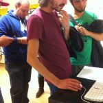
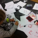
The research project was presented in the framework of the Researchers’ Night held at the Free University of Bolzano. The Researchers’ Night is an event taking place every year on a single night in about 300 cities all over Europe, with the aim of bringing together the public at large and researchers.
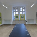
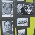
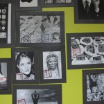
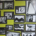
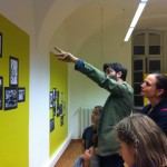
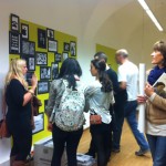
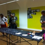
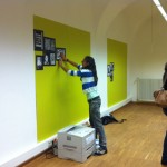
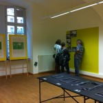
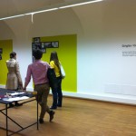
The installation, titled “The Grid”, was meant as the set for a participatory exhibit, made of images chosen by the public. People visiting the room were invited to think of visual connections to some images already on display. Images chosen by the public were downloaded from the Web and printed. After signing their chosen image, people used black magnetic frames, of different size, to display it on one of the yellow metallic panels on the wall. With the passing of time, a growing number of relations was configured and made visible on the walls, thus encouraging even more the public to stop and look at the display, to discuss images, and to think of other possible connections. The installation was highly appreciated and enjoyed by the public – both kids and adults.
The installation was intended as a “hook”, to enable the researchers to get the attention of the public and to explain them personally – along with the installation’s objectives – the aims and topic of the research project. The latter was also illustrated in a poster on display in the room.
Thursday, September 13, 2012

Small Stories Bigger Picture
MOTI Museum of the Image, Breda, NL
September 13 – December 16, 2012
Curators: Sven Ehmann (Gestalten) and Dennis Elbers (MOTI)
Statement: «Who doesn’t want to fly like a bird? And who doesn’t want to witness that? Human Bird wings, a portrait of the fictitious character Jarno Smeets and his attempts to learn how to fly went viral and went on to become an international internet sensation. Artist Floris Kaayk’s film was a world-class hoax: seen, shared and forwarded by millions, the clever YouTube movie turned out to fascinate the entire world.
We are living in a culture of images, a society where we are increasingly communicating through images rather than through language. We are visual biographers of our experiences, ideas and interests. Small Stories Bigger Picture portrays how professional image-makers share their visual stories with us from many different perspectives. Personal fascinations, registrations, analyses and provocations all create a portrait of our society’s era.
Visitors will get to discover how visual stories can stimulate people and inspire them to live a more aware life. In Small Stories Bigger Picture you will see image-makers playing the part of poet, journalist, research and agent provocateur.Visitors will literally get an aerial view of three auditoriums packed with photography, movies and design.
Small Stories Bigger Picture […] is the result of a collaboration between BredaPhoto, Graphic Design Festival Breda, the Huis voor Beeldcultuur (House of Image Culture) and MOTI.»
List of participants includes: Peter Orntoft (DEN), Floris Kaayk (NL), Kyungwoo Chun (KR) Vahram Muratyan (FR), Superfertile (GB), Francesco Franchi (IT), Sanne de Wilde (BE), Donald Weber (CAN), Xavier Barrade (FR), Nicholas Felton (USA), Chris de Bode (NL), Annelys de Vet (BE), Ji Lee (VS) en Christien Meindertsma (NL)
Watch the video from Gestalten.tv
Wednesday, August 29, 2012
The Magic of Things: Product Posters
Museum für Gestaltung, Zürich, CH
August 29, 2012 – January 6, 2013
Statement: «“The Magic of Things” explores a by-and-large obsolete advertising strategy in the area of the product poster: banal, everyday objects – butter, a sewing machine or shoes – are presented as desirable objects that entice us to buy them. Free from any further context, in the poster they acquire a sensual presence and magic aura. The product poster had its heyday in Switzerland in the 1940s with designers such as Niklaus Stoecklin, Peter Birkhäuser or Otto Baumberger. But soon the isolated focus on the product was no longer enough – the feelings associated with the objects grew increasingly important in advertising. Today the magical depiction of things is experiencing a kind of renaissance: the culture poster presents familiar objects detached from their context and reveals their special aesthetic. In addition to the posters the exhibition presents photographs and advertising films from the epoch of the product poster. They reveal different approaches to advertising products, some of them parallel and some very different.»

We Demand Happiness! Protest posters 1975-1985
MOTI Museum of the Image, Breda, NL
August 28, 2012 – February 1, 2013
Curator: Geert Lovink
Statement: «During the governement formation, MOTI will be presenting a new exhibition called We Demand Happiness! In our present era of crisis and revolution, the museum will be looking back on protest manifestations from the past. On display are Opland’s iconic protest images against cruise missiles. But also on display are posters about the mass protests against the bomb, squatter riots and protest art about the Cold War and international solidarity.
The protest posters on display at MOTI are from the private collection of Breda’s Alex de Kock. He donated his poster collection to the museum in June 2012. In an interview with producer Geert Lovink, de Kock says: “I was thirtysomething and interested in art and felt a need to collect it. I didn’t have enough money to buy so-called real art, but I saw many works of art in the streets and in bookstores in the form of these protest posters. They were being given away for free or could be bought for a guilder and I firmly believed in their extraordinary design. But immediately, I also found them to be exceptional because they displayed the era.”
For 30 years, Alex de Kock conserved the posters in his house in Oosterhout. A passionate collector who believes the protest posters are special because they remind him of the aesthetics that Soviet communism applied to puff up its ideology. As a child, he regularly visited the Soviet-Union because his mother was born in the Ukraine. After recently moving to Breda, the collector decided to donate his collection to MOTI.
Visitors will be able to see famous posters with themes such as the battle for housing and squatting, the anti-nuclear energy movement, the Peace movement, but also international solidarity and protest art. Internet critic Geert Lovink selected the posters and wrote provocative texts about the onset of the belligerent eighties.»


